After completing all product testing, we did not produce the conventional 50-page comparison report. Instead, we normalized raw test data into a four-dimensional percentile score (absorption speed, dryness, capacity, weight efficiency) and plotted every product on a single bubble chart for instant same-category positioning.
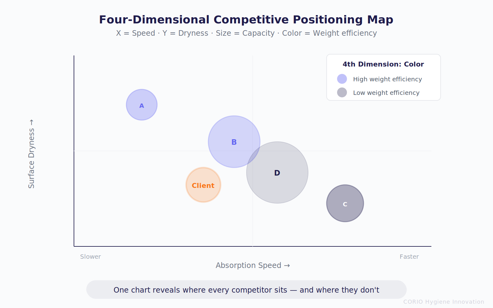
The effect was immediate: in one chart, the client could see which quadrant their product occupied, who their nearest competitor was, and where the white-space opportunities lay. The chart included two threshold lines — a “Pass” line (based on the market’s minimum acceptable standard) and a “High” line (based on the benchmark product) — making every brand’s strengths and weaknesses instantly legible.
More critically: we produced independent bubble charts for diapers and pull-up pants. Comparing the two revealed that a single brand’s performance can shift dramatically when migrating from diapers to pull-ups — one premium-positioned brand ranked at the top in the diaper category but saw its key metric collapse by over 40× in the pull-up category.
The bubble chart is not a one-time snapshot. As subsequent test rounds and new supplier samples generate data, the chart updates continuously — it is a living competitive intelligence asset.